Friday, September 25, 2015

2D3D Week 5 -- To Fish Or Not To Fish?

Its really not a question. You have to fish. For a grade and for practice!

So this week consisted of doing everything we did for Weeks 1-4 and applying them all in one week!

Here is my progress:


This is my low-res fish model I started with.

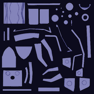
Next, I fitted all the UVs to the model.

From here I created a higher-res model to pull into ZBrush.

ZBrush is a great program! I really like playing in ZBrush! I am still not that amazing at it, and still need to learn a few tips and tricks, but I can easily spend time in it.

I don't have an accurate image of my ZBrush sculpting at this stage, but I do have an older one...


I noticed in this version I had some weird black shading going on with my normal maps that I went back and fixed.

After I sculpted, I decimated the model then I spent some time baking. It took me about 5-6 bakes to finally get a normal map I was okay with.

The AO map was a similar process. It took a few tries to get them the way I wanted them to look.

I also created a POS map as well as a specular map. There isn't too much to say about these maps since they are all pretty much trial and error.

I did want to make a future note for myself that these maps all get layered on top of each other after you create your color map.

After I finished baking out these maps, I sent the model into Mudbox. This is another great program where I love to put on headphones and go to town. I pulled up some color reference material and switched between coloring in Photoshop and coloring in Mudbox. I didn't use much texture variance here since it was a fish, but I did add some nice scale stencils.

Here is my colored fishie!


And my final rendered fishie:


Lastly, we need to always make sure the model looks good in whatever engine you use. Our engine of choice is UE4.


I really like how this turned out more than my model! I am super proud of this fish wayyy more so than my cannon.

Learn & Grow:
1. Understanding Mapping
I still have a hard time understanding where and when the maps get used. I understand the normal map, but are the AO and POS maps required for a model? My understanding is that it's mainly for aesthetics.
2. Decimate your model!
Somehow I missed this step with my cannon? It's not a big deal for these models since they are so .. "small".. but I did decimate my fish to try it. Its very nice to know also in ZBrush that decimating your model removes UVs! Speaking of...
3. ALIGN YOUR UVS!!
I ran into a newbie mistake with my UVs. I just left them in whatever shape or alignment they happened to fall in. This created way more headaches than I wanted it too. Not for my normal maps, but for my AO, Spec and POS maps.Next time, make sure that if you can, align your UVs how they would work on the fish. A specific example of this is for my POS map where I created a ramp gradient. One half of the fish was below the other half and the gradient made one side of the fish black, and the other side white. Awesome.

I was super nervous about making sure I followed each and every step correctly! I did have to ask a lot of questions and tips and tricks for certain programs, but I feel it turned out well, especially for cramming everything we learned over the past four weeks into one! Now, time to work on my RPP!

Friday, September 18, 2015

2D3D: Week 4 -- Presenting the Final Cannon Model

Yaaay! Nothing has ever felt so good than to complete a project! I also can't believe how much I've learned in four weeks! My head is spinning already!

While working in Maya definitely had its ups and downs, there is a MASSIVE sense of accomplishment to finally have something presentable. Granted, this cannon is not anything I would put in a portfolio or even  have them on the desktop together, it feels good knowing I have gained enough knowledge to learn and grow in this program.

Results:

My final cannon displayed in the UE4 engine.


Learning Opportunities:
1. Exporting Versions
I struggled a bit making sure all my versions matched up and worked properly between 2015 and 2016 systems. This is something I need to note to myself going forward.

2. Remember: Flat Lighting = off
I received critique to make my cannon better match the environment of the character that would be using it. My model was particularly dark in Maya and I could not figure out why my model was so light in Mudbox. I didn't have my Mudbox flat lighting off and came out with another dark-colored model. Le sigh.


3. But there is a positive side to this mistake...!
While I was really disappointed that I spent hours painting a model that wasn't light anymore, we learned some neat tricks that UE4 can adjust specularity and roughness. While the teacher was going over each of these adjustments, it was really awesome to play with these features since it did apply to me and my model.  Yes, I was made aware it's better to just make these changes in Maya or Photoshop, it benefited me in this case to just.... play and deal with it.

Wednesday, September 16, 2015

Drawing Fundamentals: Week 2 & 3 -- Design and Perspective

Catching up on the last two weeks of my drawing fundamentals art class.

Week 2: Design Concepts
Our first assignment was to judge how we fared drawing designs in the categories of character, weaponry and architecture. The teacher provided images for the weapon, character and building. They are not creations of my own.

I really enjoyed this assignment and drawing all three! My best in my opinion is the character design, and my weakest was the building. Identifying my weakness lets me know where I need to focus more on. Actually, week 2 helped me practice buildings and perspective.

Week 1 Results


Week 3: Perspective
This assignment was intimidating if anything! I was really nervous to make sure all the lines were straight and how to get in color and details with such fine pen details in my drawings. I wanted to challenge myself by drawing intricate architecture, which I am not sure if that was a great idea or not. While finding churches and beautiful old architecture for these churches, it may look like I did not take too much perspective into account, but each tile and brick I laid out as well.

Week 3 Results


Week 2 & 3 Identified Problems and Solutions
1. Keeping my lines straight
I learned with the first Week 2 assignment that I need to use my ruler and use it well. During class we learned to quickly lay out perspective, but we weren't given too much time to flush them out. Drawing these so they looked nice and straight took a lot of my time and gradually I got better at it. My process became: Sketch, Ink, Color, Shade, Light.
2. Color
I will admit using and identifying color is one of my least developed skills. All of my teachers have been great in encouraging the use of color, even if it might look weird. I found that my love for the new water color pencils still needs work to master, but I keep trying to use them! I also got a LOT of inspiration from my classmates! A few of them use color very very well and it makes the image look great. I decided to make use of all three primary colors and even tried to blend them in the 3 point perspective. Attempting blending with these colors will be my next try going forward.
3. Getting over critique!
This is still something that just makes my heart POUND. Each week we walk around and view everyone's work. Even though these are practice sketches to get us used to drawing again, I still get very nervous about not being good or not having something good to show in class. However, if you noticed, I contradicted myself from my last problem and this nervousness! Despite me being nervous, I am learning by watching and learning from my peers and taking what I like from their drawings and applying them to mine. So, while I need to learn to stop being nervous, it has helped increased my own art.  :)

Tuesday, September 15, 2015

Common Art: Week 3 -- Lionel the Starfish

His name is Lionel and he will be my Lionel to hold and squeeze and ... well, you get the idea.

Our assignment in our Common Art class for week 3 is modeling a starfish. A starfish who looks like he's taken the wrong path in life to say the least!

There was a tutorial provided with this model which I followed to make sure I am continuing to develop best practices for modelling.

Results:


Above is my final hard surface model. I had a few tweaks I had to make after the model was complete. I ran into four issues before I could finally complete my model.

Overcoming Problems

1. Merging the verts. 
I tried everything in the books, but I could not get the middle verts to merge no matter what I tried. I had a guess that the reason I couldn't was because I didn't combine the model. My assumption was correct and that is how I overcame that issue.

2. Non-deleting edges.
This was the most frustrating thing I had problems with. I ended up cutting each of the non-deleting edges with the multi-cut tool and just merging the verts with ones near them to get rid of them. I never could find out they wouldn't delete.

3. Filling in holes.
This was not necessarily a "problem" as much as it was learning how to the use the tools better. One benefit in Maya is that there are multiple ways to achieve the same goal, so I was introduced to ways to fill holes and gaps in the geo I may have found.

4. Fixing Normals.
Despite following the tutorial, there was still a few normals that I had to go back and make sure were facing the wrong way or to make sure there were no hidden faces.

Final Hard-Surface Wireframe

What I learned:
I want to start introducing a problem and solving section for my future posts. I want to identify what issues I had and what I did to resolve them. I believe that keeping those notes on this blog will help show what I truly went through for this model.

This was a great relatively easy model to get more practice on. 

I learned how to check my normals more efficiently. While clicking through on the smoothing, I noticed a few normals facing in weird directions. Most of them were easy fixes by either reversing or deleting the face that somehow managed to get into my model.

My total tri amount was 760 and I'll admit thats probably higher than necessary. There were a few areas I wanted more detail or curvature in to get the shape that I wanted.

Final Smooth-Surface Model -- Total Tri: 760

I enjoyed the starfish and it was really good practice with an organic shape. I love the slight detail and texture that the tutorial implemented to really show off the eyebrow mass and the jawline.

Thursday, September 10, 2015

3D Modeling - Week 3: Baking -- and I don't mean cookies

The next adventure of my modeling introduction is baking!

They look very similar to the UV maps and are reliant upon them, but they take so much less work to figure out.

There are three different bakes we were introduced too: Normal, Ambient (OA) and Position maps.

Normal Mapping
This is the first and most important map to bake and set up correctly first. I had to take a few parts of it into Photoshop and fix some areas that didn't look as well.

My bake ended up as this beautiful rainbow:

My only concern about the bake is that it is difficult to tell, with no experience, where the problems will happen from the bake to your model.

My low-res model with the normal maps applied: 


It LOOKS pretty okay from what I can tell. I am not quite sure what I am looking for as far as problems go though. Correcting the envelope was a small issue that I worked through as well as I had to go back and fix some unfolded with my original UV mapping.

AO Mapping
The next mapping we were introduced to was Ambient or AO mapping. This was a nifty way to color and place textures on the model. This mapping went a bit faster, so there is not as much to explain besides me not being able to tell what is wrong with the final model.

My initial AO Bake is a simple black and white bake showing all the dings and dents:


I cleaned it up in Photoshop and changed some of the coloring to make it look less harsh with such a high contrast.


Applied to my final model where I think it looks like it wasn't applied well, but I am not sure why the map isn't updating.


See the black on the edges? No idea.

Position Mapping
The third and final baking was for positional mapping. This allows a super awesome gradient to be applied to your model to get it looking suave. :)

My model pre-bake. See that nice gradient? 


Here is the final baking that came from the above model:


I decided to play with the lighting and gradient more and decided to try out some colors:


This was taken into Photoshop and I just created a mask to apply to the cannon bake.

The cannon ultimately ended up looking like this with this particular bake:


Mudbox
After applying all three bakes to my low-res model, I brought the model into Mudbox 2016 and hand-painted the model.

This image is my final normal map that was ultimately baked from my high-res model to my low-res model.


This was my model first brought into Mudbox. The red dots indicate where triangles are, which is not a problem for this model.


This is the final result after painting my model. I wanted my cannon to have gold plates sitting on a stone base.


Notes:
This processes really helped me understand more of the 3D modeling process. The process I have so far:
- Create Low Res Model
- Create UV Map
- Create High Res Model (but keep the low res available)
- Bring Higher-Res Model into ZBrush to texture the model
- Take that final High-Res and sculpted model and bake three maps:
   - Normal
   - AO
   - Pos
           *Normal Map is the BMP map, AO and Pos are layered to create color for the model.

- Bake those onto the lower res-model to give it the appearance of a high-res model.
- Take that model into Mudbox to give it color and more texture.

Wednesday, September 9, 2015

Drawing Fundamentals

What does the title mean?

Simply, we are introduced to new drawing tools and learn new techniques to apply to our art. We literally draw with these tools and apply techniques we learned in times exercises.

The most important new tool - tan paper. I have never drawn on tan paper before, but it creates an excellent medium with all the new tools and softens the colors to make the darks seem darker and the lights lighter. I am not used to working in such a mid-range tone, but so far it does create a really interesting and notable effect with the actual tools when I am coloring.

First of the new tools I am learning are water-based colored pencils. I wish I had known about these sooner! They create such a lovely blend of color and value with little effort besides making sure you don't soak the paper. They are extremely fun.

They are paired with another new tool called the water brush/pen. It looks like a plastic ink pen, but its filled with water instead. The tip is a very fine brush that pulls the colors from the darkest range to the lightest in a nice gradient. I will definitely be trying to use these tools more often.

The white gel pen. Not a big deal? Wrong. The white gel pen absolutely knows how to make your drawings pop. Placed correctly with your inked outline, it can really make any line pop and draw the viewers eye. It does take a bit to master where and when is the best use for the gel pen.

Micropens .05 and .02 are easily my favorite. I've been wanting to switch to drawing in pens only, but I still am not confident in my anatomy and drawings enough to switch over completely. The pens are so fluid and lay very well across the paper.

Our next assignment consists of drawing three different types of drawings and using perspective and light. It will be interesting to see how I can use value to apply these affects.

Tuesday, September 8, 2015

Common Art: Week 2

This next homework assignment was a group effort to redesign a popular Nintendo character.

The instructions were clear. In my group of 3, we have one artist create a silhouette, gray scale and color scale of the main character, another artist creates the model sheet for the main character, and the final person creates a new environment for the character.

I decided to choose the environment portrayal since this is an aspect of art and design I feel my interests lie.

Group Collaboration
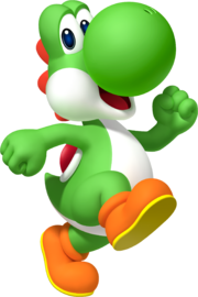
My group began our character design by choosing the popular Nintendo character: Yoshi.


After viewing 20+ different silhouettes by Teammate 1, the three of us decided on a short but burly  version of Yoshi. 

Teammate 2 finished a proper model sheet of our version of Yoshi, portraying him as a bad koopa gone good. 

We really enjoyed the twist of having a darker, noir style for Mario and giving Yoshi more of a backstory than just loyal steed.

This gave me an idea of a run-down mushroom kingdom. Trash, paper and baddies swarm the area and everything has a dark hue associated with it.

My final result came out rather cartoony, but I tried to implement a rougher, sketchier environment with thick lines and clues to other Mario games.


Friday, September 4, 2015

3D Modeling - Week 2: UV Mapping and ZBrush

New notches for my belt! This was a challenging assignment for me being completely new to these skills, but looking back, I really did learn a lot.

The second assignment was to take the model from assignment 1 and create a UV map as well as bringing the model into Zbrush to sculpt.

I will cover each of these assignments separately.

Part 1: UV Mapping
This part of the assignment was VERY difficult for me. I have never UV mapped before and it took many lessons and the kindness of my peers to help me understand why the UV split tool will just not split. It took me four days to completely get the UV mapping to where I was happy with them and understood where and how they need to be placed.

My frustration never rested with the concept of UV mapping, meaning, WHY we needed to UV map. To me, that could not be anymore clear.

Most of my frustrations came about because of my newness to UV mapping. I am confident that when, not if, I UV map again, I will be highly more effective at generating the mapping. 

Here are the fruits of my way-too-long labor:


I am not sure if I am happy with it, but it was the best attempt I could do and the best I could ask of myself.

Part 2: Digital Sculpting
This. This, this, this. THIS was a LOT of fun! After all those frustrating moments of UV mapping finally paid off when I was able to move onto Zbrush.

To reiterate, this is the first time I've ever seen Zbrush. Before coming, I had heard of Zbrush in whispers and in dark corners of the nether, but unsurprisingly, it really does exist!

Much to my pleasant surprise too, it's very fun! I'm not too great at sculpting yet, however just playing around with the brushes and figuring out the tablet pressure sensitivity was amazingly fun. I was taught great quick techniques to get a rusted or old feeling to apply to the canon which I felt was appropriate in the look I wanted anyway.

Here are my results: 


I went on Google and found a texture I thought fit the canon metal fairly well. Then, to add some diversity, I used a Zbrush preset brush for the sides and the ground. I added some dings and dents by hand to complete the look.

Not too bad I feel for my first attempt ever to get used to the tools and to begin to familiarize myself in this robust software.